REVIVA PHYSICAL THERAPY
Web Design | Brand Identity
From no brand or website to a polished online presence that brings in steady bookings. Read how below!
Chapter 01: The Challenge
When Reviva’s founder first reached out, she had no logo, no website, and no visual direction. Only a vision to help people heal.
To make care feel personal again.
She didn’t just need design — she needed clarity, strategy, and a strong foundation. So we got to work building a brand that felt both soft and structured, modern yet natural.
THE RESULT?
A branding that mirrors her care philosophy, and a website that turns curious visitors into booked clients.
Project Goals:
Design a warm, trustworthy brand rooted in care and professionalism
Create a website that clearly communicates services and builds trust
Help Reviva confidently show up online — and turn visibility into new bookings

Chapter 02: The Direction
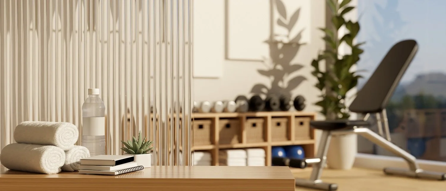
We explored earthy, grounded, feminine directions — clay, deep green, off-white, muted red.
It started warm and textured, inspired by nature and movement.

This moodboard captures the grounded, calming essence of Reviva’s approach — rooted in nature, warmth, and quiet confidence.
Each image was chosen to reflect balance: soft textures, organic shapes, and earthy tones that evoke healing without feeling clinical.
Green quickly emerged as the core, symbolizing growth and trust — so we built the entire direction around it.
Chapter 03: The Branding
The logo needed to do a lot with very little — it had to feel soft, strong, and instantly recognizable, all at once.
We explored multiple variations of weight, balance, and symbol positioning to find the one that aligned most closely with Reviva’s tone: supportive, professional, and deeply human.

We tested different alignments, letter spacing, and font weights to see how the logo would behave at various sizes and across platforms.
The chosen version (bottom) had the most balanced visual rhythm: the leaf integrates into the “R” as a subtle but powerful nod to healing and nature — without overpowering the name.
This phase proved one thing: minimal doesn’t mean boring — it means every detail counts.
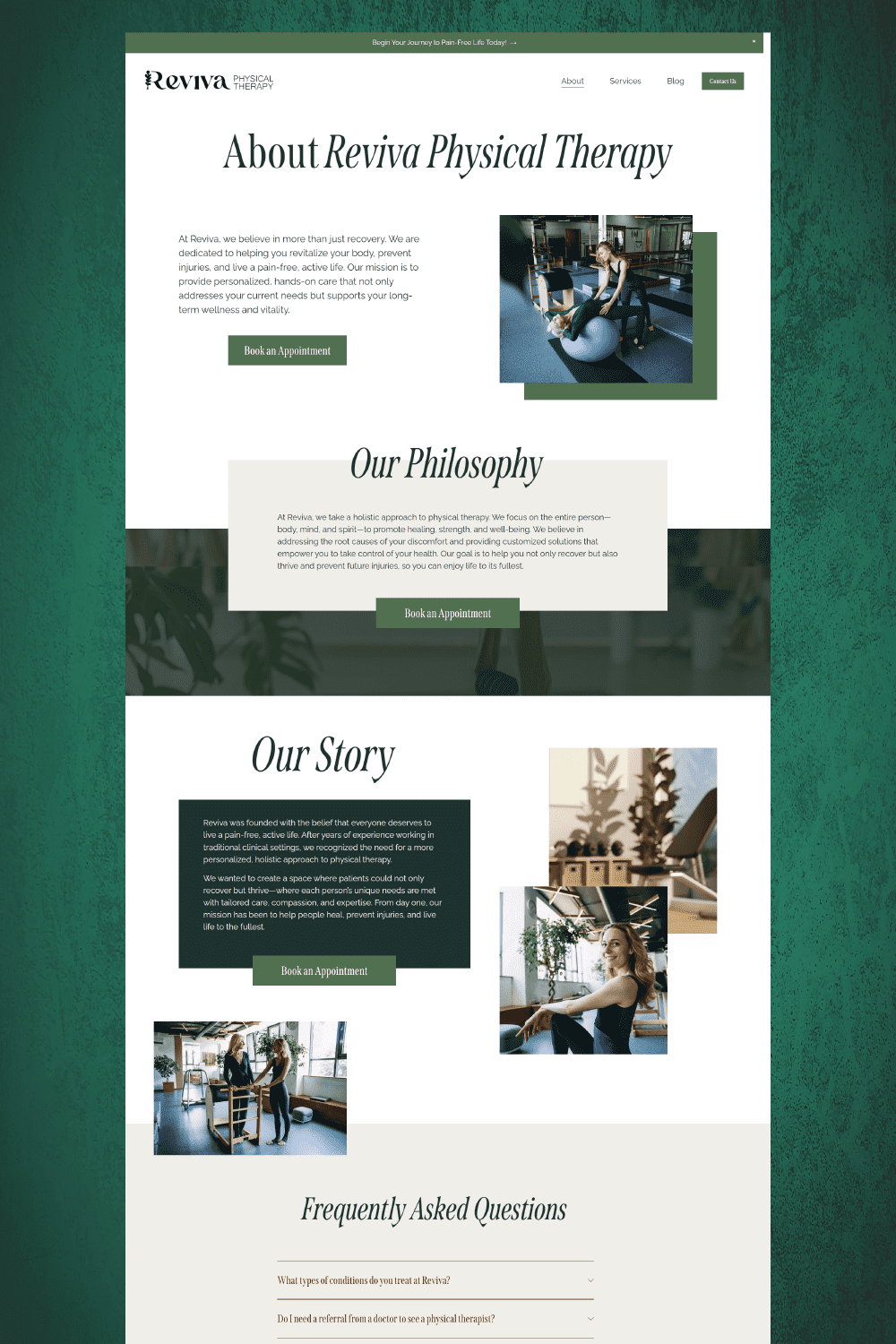
Chapter 04: The Website
We designed the site to speak before the user reads.
From the hero section, visitors should immediately understand what Reviva does, who it’s for, and why it feels different.
Website is built with strategy to increase conversions:
The homepage opens with a warm, reassuring headline and an immediate call-to-action button (“Book an Appointment”), minimizing hesitation and giving users a direct next step.
We emphasized services right away, breaking them down into clear categories each with its own booking button. This reduces overwhelm and makes it easy for visitors to find exactly what they need.
The result: A site that earns trust in seconds, communicates value clearly, and gently nudges the user toward booking — without pressure.